When I began designing Monolight, my goal was to explore the space between grotesque and geometric typefaces. I wondered if it was possible to combine the clarity of one with the freshness of the other in a single type family. This process required numerous iterations to find a satisfying balance.
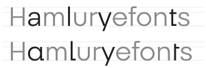
As I worked on the basic shapes, I was initially drawn to the simplicity of grotesques. Their low contrast provides good readability, which is important to me. However, I also wanted to introduce something different, and that’s where geometric influence came into play.

The letter ‘o’ is a good example of this approach. At first glance, it may seem circular, like in a geometric typeface. But upon closer inspection, you notice a slight vertical tension. This subtle detail helps define the character of the typeface. This philosophy carries through to the rest of the glyphs—forms that seem simple at first but reveal their complexity with use.
The lowercase ‘a’ presented an interesting challenge. I opted for the double-storey (by default) form typical of grotesques while constructing it with more precise curves, approaching the geometric style. These choices give Monolight its unique personality.
The letter endings also required careful consideration. A straight cut would have been simpler, but it would have made the typeface too rigid for my taste. Instead, I chose a slight taper. This barely noticeable detail softens the overall design, adding a more organic touch. The lowercase ‘g’ offered an opportunity to experiment. The single-loop form fits within the grotesque tradition, but I took some liberties with the counterform and the tail, incorporating a hint of geometric precision.
The issue of proportions also required many adjustments. Grotesques often tend toward uniform letter widths, while geometrics feature more variable widths. I aimed for a compromise that would maintain the regularity of grotesques while integrating some of the dynamism of geometrics.
This project has taught me the importance of small details in typography. Every curve and angle underwent multiple revisions.
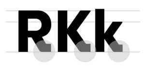
In the design of Monolight, I also paid special attention to certain uppercase letters, particularly the R and K. These characters often pose challenges in terms of visual balance and anchoring on the baseline. To solve this, I introduced diagonal extensions to the stems of these letters.
These extensions, which could be called “diagonal serifs” or “slanted terminals,” are not traditional serifs. Rather, they represent a subtle fusion between the sans-serif approach of grotesques and a functional need to visually ground these characters.
For the R and K, for instance, I slightly extended the right leg diagonally toward the baseline. This adjustment brings several advantages:
- It creates a smoother transition between the vertical stem and the horizontal baseline.
- It increases the visual contact with the baseline, enhancing the character’s sense of stability.
- It helps distinguish the R more clearly from similar letters like P or B, improving overall readability.
These subtle additions illustrate Monolight’s thoughtful approach—a considered synthesis of the structural clarity of grotesques with functional elements drawn from other typographic styles. While these extensions might resemble serifs, their function is closer to the terminals found in some humanist sans-serifs.
In my typographic optimization process, I also strengthened the visual foundation of certain characters by amplifying their contact points with the baseline. This approach draws directly from the proven principles of serif typefaces, where horizontal serifs play a crucial role in optical stabilization and reading guidance.
By applying this concept to the bottom vertices of capitals, particularly in letters like ‘V’ and ‘W’, I created an anchoring effect similar to that of serifs, but adapted to a sans-serif design. In heavier weights (Medium to Black), the significant widening of these vertices acts as a virtual serif that stabilizes the reader’s eye. This technical solution not only improves continuous text readability but also ensures better visual rhythm in the composition, echoing the historical effectiveness of serifs in traditional typefaces.

Introducing these elements required careful fine-tuning to maintain visual coherence with the rest of the alphabet. It was crucial that these additions didn’t disrupt the overall harmony of the typeface or shift it into a different typographic category.
Though subtle, these modifications play an important role in enhancing the readability and flow of Monolight, especially in smaller text sizes where every detail matters.
My intention was not to create a revolutionary typeface but to explore how established styles can be combined to create something familiar yet subtly new. I can’t claim to have created the perfect synthesis of grotesque and geometric with Monolight. What I do know is that this project has made me think deeply about letter anatomy and what makes a typeface both readable and engaging. I hope users of Monolight will appreciate the typographic subtleties that guided its creation.
