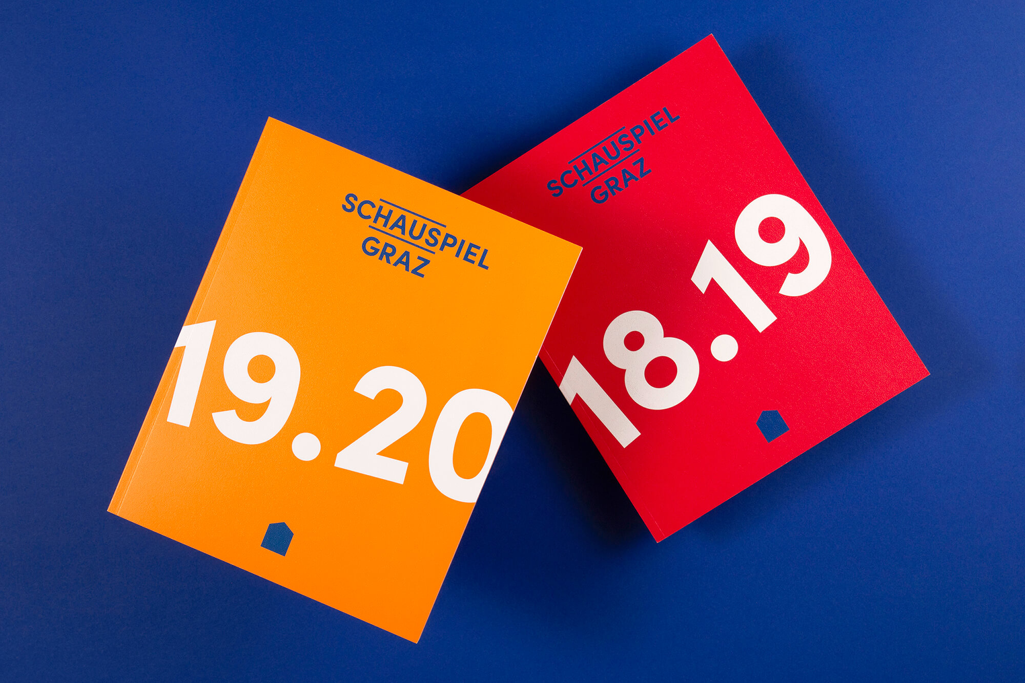
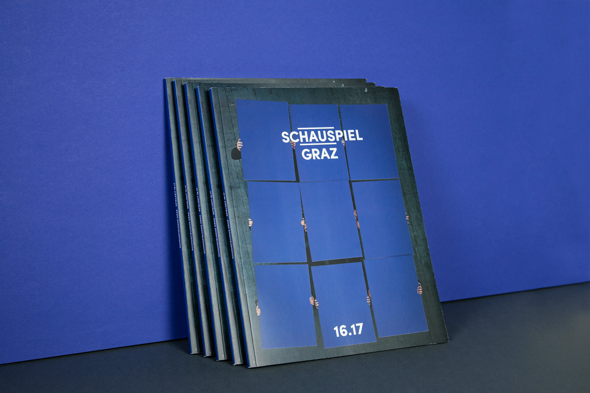
There are sometimes branding and graphic design projects that are a true success, ones you love to look at again and again. The work of the creative studio Fromdusche (formdusche.de) is the perfect example. This Berlin-based studio collaborated with Schauspielhaus Graz to craft a striking visual identity, capturing the bold and modern essence of the theater. At the heart of this visual transformation is the Sofia Pro typeface, which played a central role in shaping the project’s overall aesthetic. The careful selection of typography reflects the theater’s desire to adopt a contemporary and refreshing image, in tune with its ever-evolving audience.
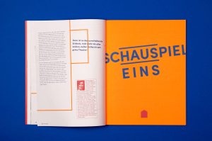
With its clean geometric shapes and high versatility, Sofia Pro proved to be the ideal choice to embody the artistic vision of Schauspielhaus Graz. Its adaptability across various mediums—both print and digital—enabled the theater to maintain a cohesive visual language throughout all communication materials. Whether it’s posters, brochures, or the theater’s website, Sofia Pro’s minimalist elegance ensures legibility and consistency, uniting all design elements under a single visual identity.
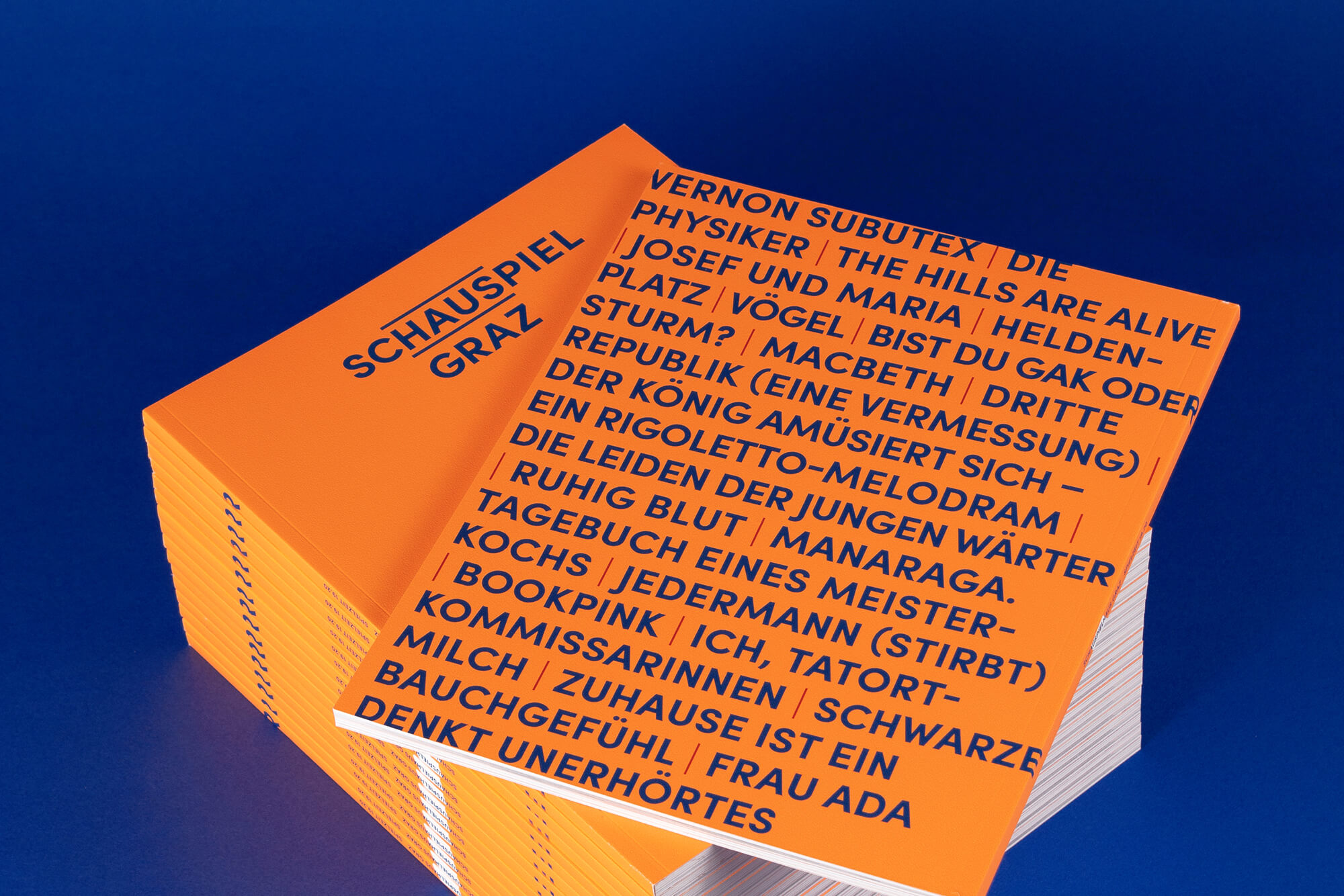
One of the most captivating aspects of this new identity is the use of a neon orange accent, bringing a dynamic and energetic touch to the design. This vibrant color, paired with Sofia Pro’s clean lines, creates a striking visual contrast that immediately grabs attention. The orange accent is not merely decorative; it symbolizes the theater’s innovative approach, setting the stage for bold and avant-garde performances throughout the 19.20 season.

Schauspielhaus Graz’s exploration of the theme of “Heimat” (homeland) this season is visually echoed in Sofia Pro’s flexibility. The typeface allows for nuanced representation of the themes the theater seeks to explore, whether in posters, digital ads, or performance programs. It strikes a perfect balance between modernity and timelessness, becoming a powerful tool for communicating the theater’s progressive agenda while respecting its cultural roots.
The collaboration between Fromdusche and Schauspielhaus Graz highlights the essential role typography plays in the performing arts. Sofia Pro not only conveys the written message but also helps define the theater’s identity, lending it a contemporary touch that resonates with a modern audience. This project illustrates the immense potential a well-chosen typeface has to shape and elevate an entire brand.

By using Sofia Pro as the cornerstone of this visual identity, Fromdusche Studio not only created a rigorous and cohesive aesthetic but also laid the foundation for a new visual era. By combining typography and design with the theater’s artistic programming, Fromdusche has crafted a vibrant identity that reflects the very essence of Schauspielhaus: creativity, innovation, and boldness to challenge the status quo.
Photos: Formdusche Berlin.- All Rights Reserved.
