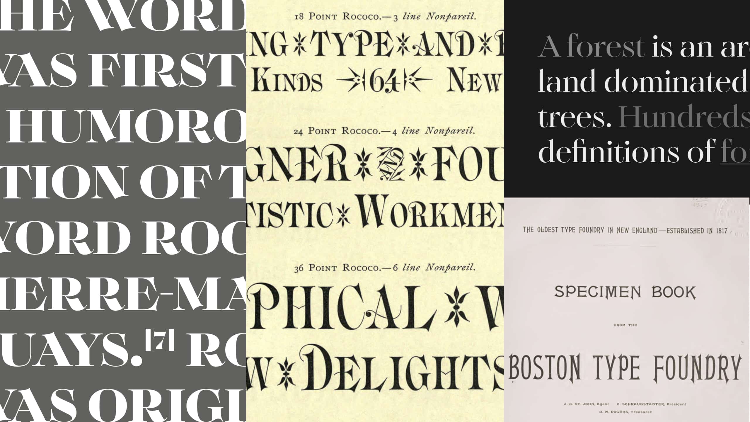
As a type designer, I am often guided by diverse inspirations, sometimes difficult to rationalize. However, the creation of Solena Pro stands out, as it tells a true story. It all began when I discovered a fascinating specimen from the Boston Type Foundry, an institution that played a significant role in the history of American typography.
This discovery led me to delve deeper into the Boston Type Foundry, which was founded in 1817. At the time, this foundry was instrumental in spreading ideas across the United States, thanks to the exceptional quality of its typefaces. What captivated me the most was the work of Charles E. Meyer, a visionary who revolutionized American typographic art. His most iconic creation, the Rococo typeface, became the starting point for my Solena Pro project.
To bring this new typeface to life, I immersed myself in a thorough study of the Rococo movement. Through my research, I discovered that, contrary to my initial impressions, this style was not limited to floral motifs. In fact, it draws inspiration from natural forms like pebbles and shell-like curves, characterized by generous, asymmetrical lines and intricate ornaments.
The challenge I faced was capturing the essence of Rococo while modernizing it to meet contemporary design demands. I designed Solena Pro with a focus on several key aspects. First, I opted for generous, curved serifs that evoke the elegance and fluidity of the Rococo style. I also created exceptionally wide characters, with ample descenders, to instill a sense of luxury and space in each letter.
A major innovation in Solena Pro, compared to its original inspiration, is the addition of lowercase letters, which were absent from Meyer’s version. This decision allowed me to expand the font’s versatility while maintaining its distinctive spirit. To modernize the typeface further, I harmonized the character widths and chose a completely vertical axis, giving Solena Pro a more contemporary look while preserving its historical charm.
One element I was keen to retain from Meyer’s original design was the prominent apex and vertex overflows that extend beyond the characters. These details, which I find particularly elegant and original, bring a calligraphic dimension that perfectly complements the intricate Rococo style. To me, they serve as a bridge between historical heritage and modern innovation.
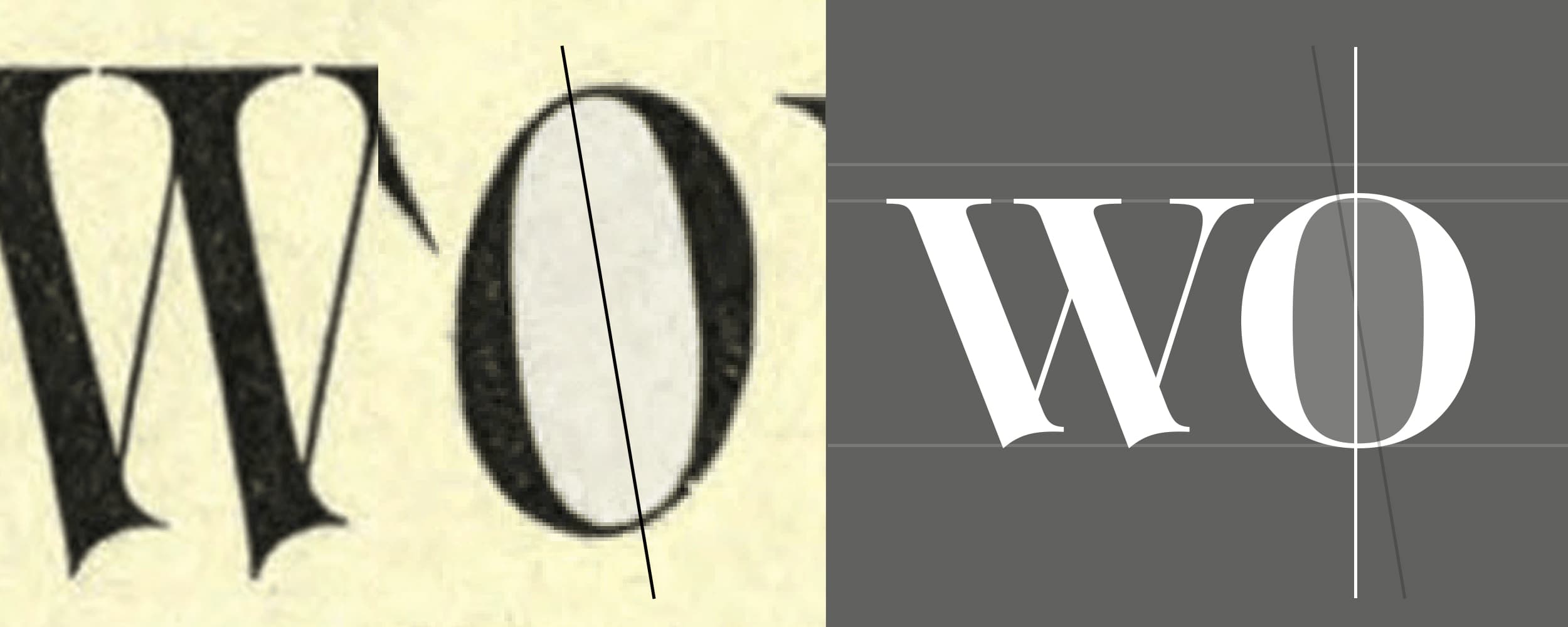
In developing Solena Pro, my goal was to transform the characteristic extravagance of Rococo into a typographic luxury suited to our time. Unlike the condensed appearance of Meyer’s original alphabet, which I found somewhat at odds with the flamboyant spirit of the movement, I opted for wider letterforms. This approach allows Solena Pro’s luxurious serifs to fully unfold in word compositions, striking a balance between opulence and readability.
Revisiting an existing typeface is never an easy task. My aim was to breathe new life into an already established font, extracting the best of its essence to create something truly new. It’s much like a singer reinterpreting a classic song: everyone will form their own opinion on the result.
With Solena Pro, I sincerely hope I have succeeded in creating a typeface that embodies a true typographic renaissance. My ambition was to combine the opulence of the past with modern functionality, offering contemporary designers a unique tool for crafting visual compositions that are both elegant and expressive. I see it as particularly well-suited for branding and logo design, where typographic elegance and sophistication are often sought after.
Solena Pro is the result of a passion for typographic history and a drive for innovation, and I hope it will inspire creators to explore new possibilities in their designs.
For more insights, you can check out the Identifont website, where I answered some questions during the official launch. You can also read an article on Communication Arts, available here.
