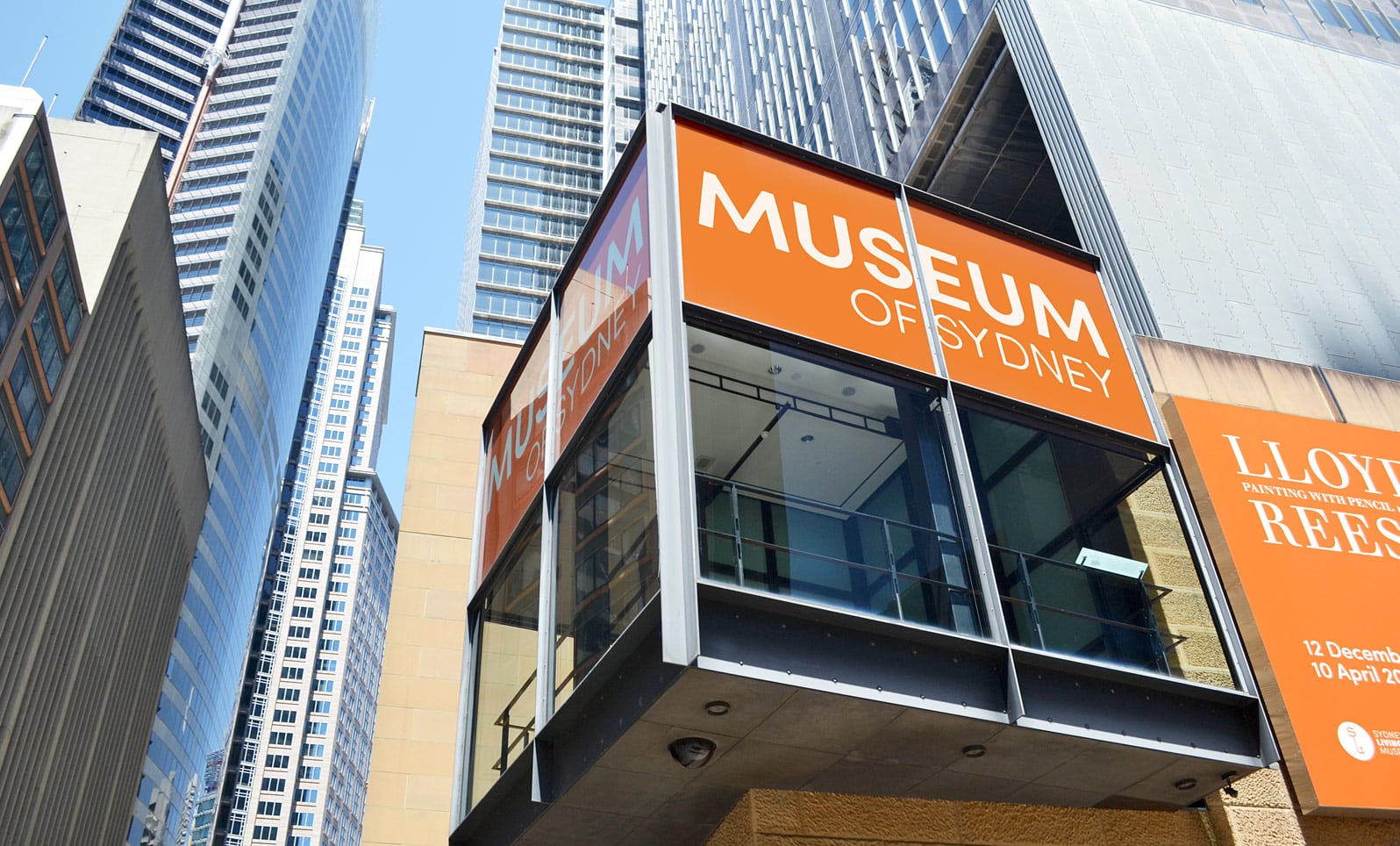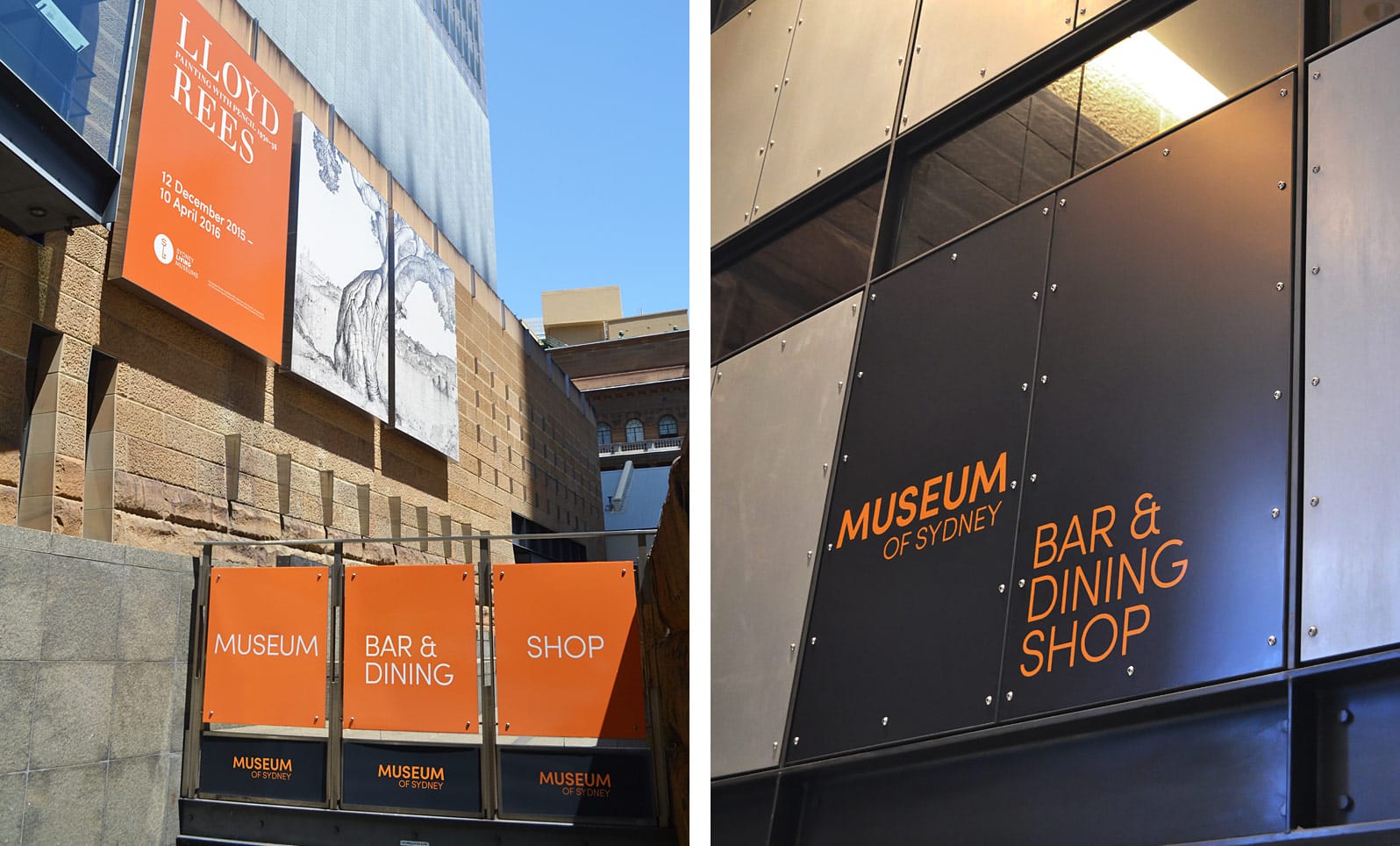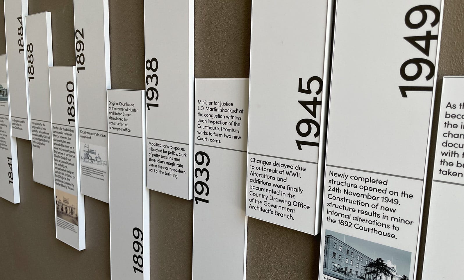
The signage project for the Sydney museum, designed by the Minale Gerber agency, prominently features the Sofia Pro typeface to create a visual identity that is both modern and functional. Minale Gerber developed a strategy that combines aesthetics and readability, selecting Sofia Pro for its clarity and versatility. This geometric sans-serif typeface is used across all signage elements within the museum, from directional signs to exhibition descriptions. Its readability, even from a distance, and its clean design effectively guide visitors while reinforcing the museum’s contemporary visual identity.


The integration of Sofia Pro is part of a broader approach to modernize the visitor experience while ensuring visual consistency throughout the museum’s spaces. The choice of this typeface reflects the desire to create a sophisticated and welcoming atmosphere, in line with the image of the Sydney museum.
Source : Minale Gerber design agency – All rights reserved
