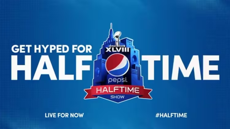
During the Super Bowl 2014, Pepsi captured viewers’ attention with a memorable advertising campaign that featured the Sofia Pro typeface. As an iconic brand, Pepsi has always known how to use eye-catching visual elements to stand out, and this time, Sofia Pro was chosen to bring a modern and dynamic touch to its ads.
The Pepsi campaign during the halftime show was more than just a commercial; it represented an immersive experience, combining music, dance, and visual design. Sofia Pro played a key role in this approach, offering clear and contemporary typography that resonated with the audience. Its versatility and readability ensured that the brand’s messages were not only attractive but also easily understandable, even in the dynamic context of a live event.


Pepsi’s advertisements during the Super Bowl are known for their creativity and impact. By incorporating Sofia Pro, the brand reinforced its visual identity while ensuring that the message was perfectly aligned with the energy and excitement of the event. The typeface was used for catchy slogans and graphic elements that contributed to the festive atmosphere of the campaign.
Moreover, the use of Sofia Pro helped create cohesion across various communication channels, whether in TV commercials, online banners, or social media posts. This uniformity is essential for a brand of Pepsi’s stature, which must maintain a strong and recognizable image across all its platforms.
In summary, the presence of Sofia Pro in Pepsi’s advertisements during Super Bowl 2014 demonstrated how well-chosen typography can enhance an advertising campaign, adding a visual dimension that grabs attention while ensuring clear and effective communication. This collaboration between design and marketing illustrates the importance of typography in shaping a brand’s identity
Related Grey
Source : Spinifex Group, Related Grey, Pepsico. All rights reserved.
